Which Cohorts Are Selling, And Which Are Buying?
On-chain analytic firm Glassnode has broken down which Bitcoin cohorts have been accumulating and which have been distributed during the past year.
Bitcoin Whales Distributed Coins Equivalent To 60% Of Mined Supply In The Last 12 Months
As per data from Glassnode, whales, miners, and exchange outflows were the primary distribution sources in the past year. The relevant indicator here is the “yearly absorption rates,” which measures the yearly Bitcoin balance changes of the different cohorts in the market and compares them with the number of coins issued over this period.
The “coins issued” refer to the total amount BTC miners receive as block rewards for mining a block. These new coins produced have to go somewhere, and that’s what the yearly absorption rates metric tries to paint a picture of the BTC supply flow.
The cohorts that Glassnode has considered are the shrimps (investors holding less than 1 BTC), crabs (between 1 to 10 BTC), whales (more than 1,000 BTC), and miners. Additionally, the firm has also included data for the “exchange outflows,” which measure the total number of coins withdrawn from the wallets of all centralized exchanges.
Now, first, below there is a chart that shows which of these investor groups were absorbing a positive amount of the yearly coin issuance:
The value of the metrics seem to have been quite high in recent weeks | Source: Glassnode on Twitter
As shown in the above graph, the Bitcoin yearly absorption rate of the shrimps is 107% right now, meaning that this investor group added 107% of the total number of coins issued on the network to their holdings during the past year.
The indicator’s value has been even higher for the crabs at around 120%. From the chart, it’s apparent that the metric has observed a very rapid rise in the last few months, suggesting that a lot of accumulation took place at the lows following the FTX collapse.
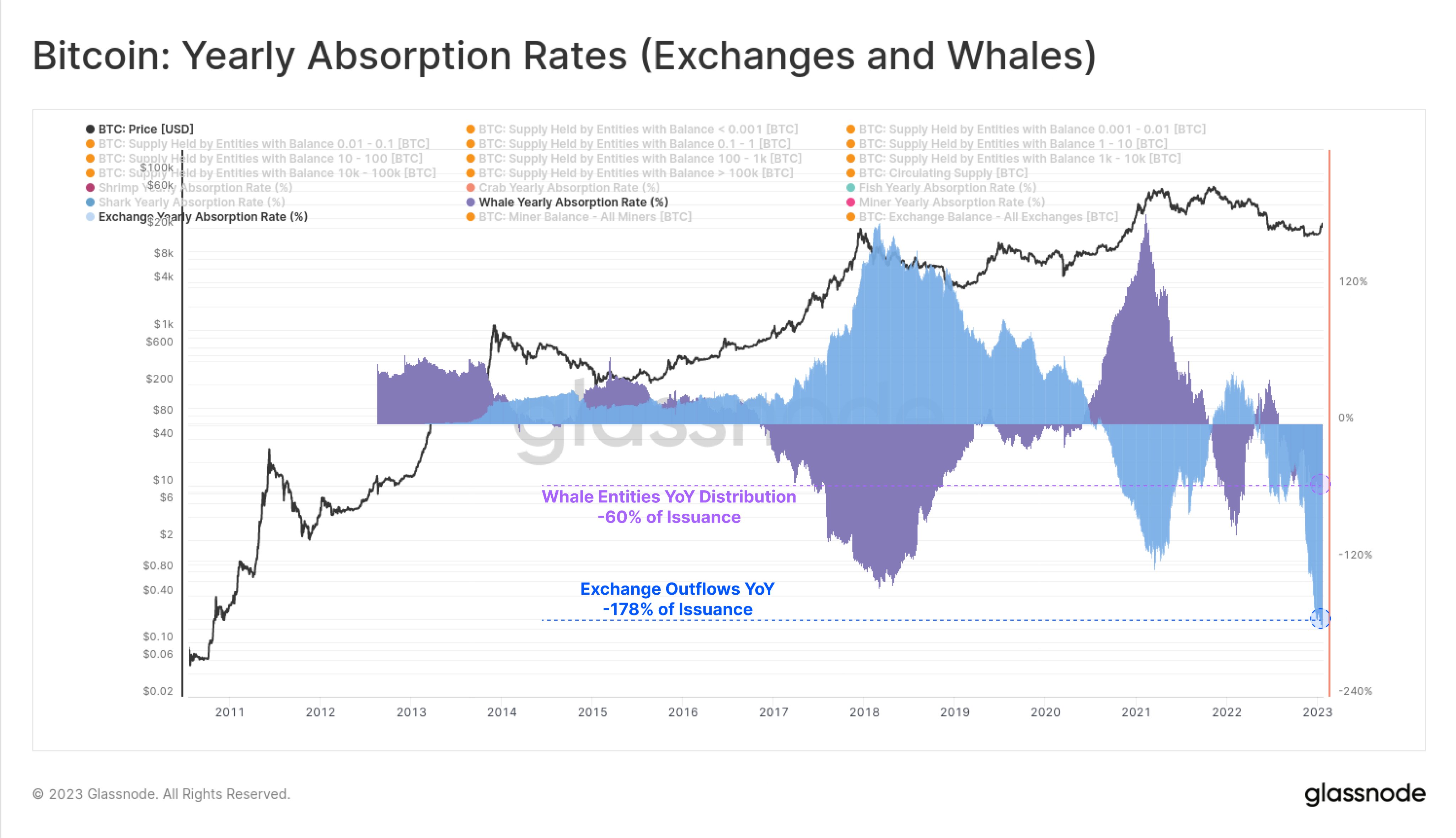
Since the amounts added by these cohorts are higher than what the network issued in the past year, it seems reasonable to assume that some groups must have distributed or sold their coins to make up for the difference. The below chart shows which cohorts displayed distribution behavior during the past year.
Looks like these metrics have been deeply negative recently | Source: Glassnode on Twitter
It seems that the yearly absorption rate of the whales is 60% underwater, which suggests that these humongous holders have shed coins equal to 60% of the issued supply from their wallets over the past year.
Exchanges also distributed a massive amount of Bitcoin as the metric’s value was negative 178% for exchange outflows. These platforms observed large withdrawals in this period partly because of the FTX collapse, which made BTC holders more aware of the risks of keeping their coins in centralized wallets. This led to a massive migration of the BTC kept on centralized entities.
Users transfer large amounts of BTC from exchanges to keep their holdings in privately owned hardware wallets. Though not displayed in the chart, Glassnode also mentions in the tweet that miners distributed 100% of the coins they mined (which means 100% of the issuance), plus an additional 2% from their existing reserves.
BTC Price
At the time of writing, Bitcoin is trading around $22,600, up 8% in the last week.

BTC continues to move sideways | Source: BTCUSD on TradingView
Featured image from Kanchanara on Unsplash.com, charts from TradingView.com, Glassnode.com
Credit: Source link


Comments are closed.